University of New Hampshire brand & website
As part of revitalizing the century-old university’s brand for the next generation of learners, I partnered with the University of New Hampshire to rebuild its website from the ground up—developing a cohesive design system, overseeing detailed development, and guiding the integration of art and storytelling. Insights from that digital transformation informed a comprehensive, 100-page brand guide, empowering communicators across the university system to bring the new look, feel, and voice to life.
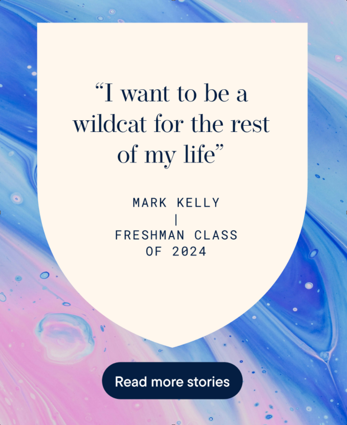
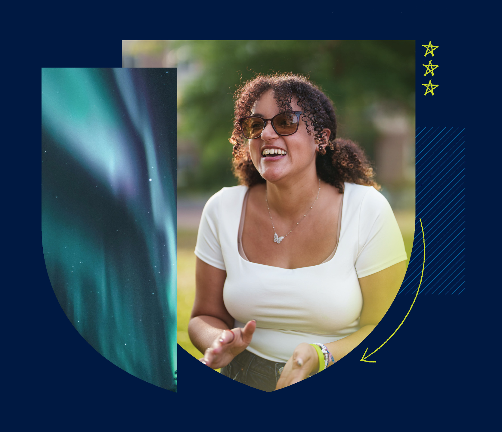
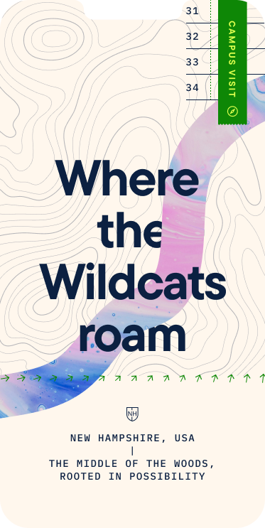
Boosting applications by reflecting student growth & wonder
When University of New Hampshire was ready for a rebrand, the 160-year-old institution asked us to set them up for the future.
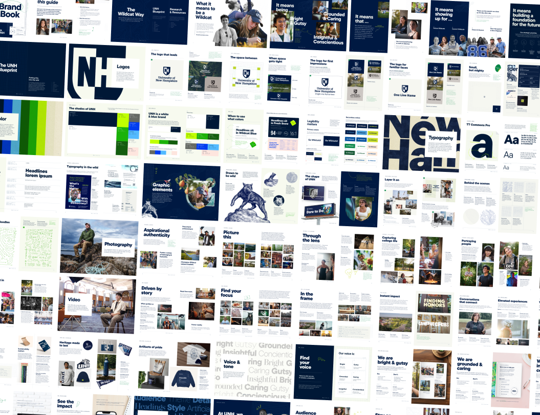
They were looking for a brand that matched the energy, intelligence, and impact of their students and faculty. It needed to honor their rich history while showing their constant drive to innovate. And they needed it right away.
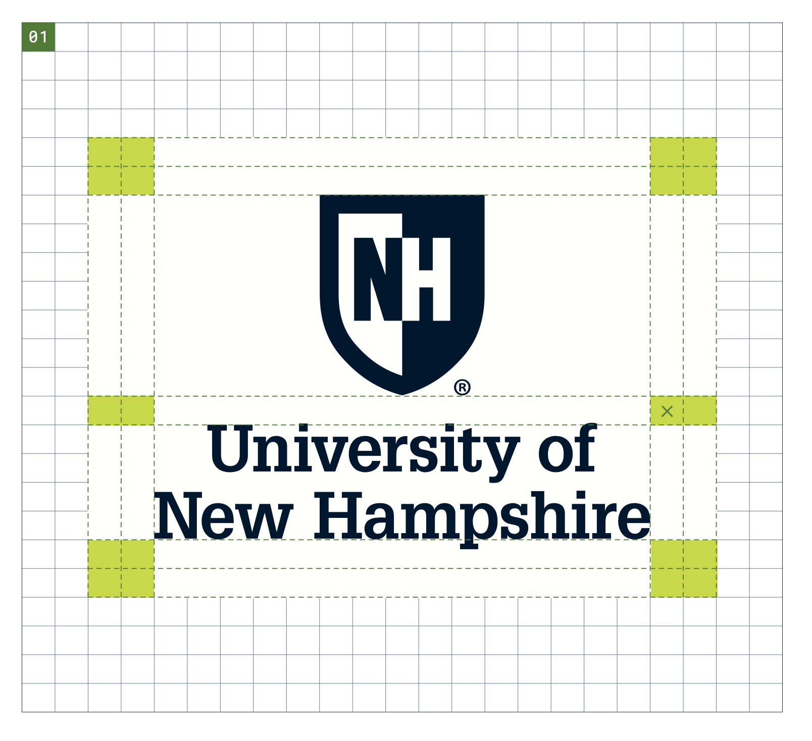
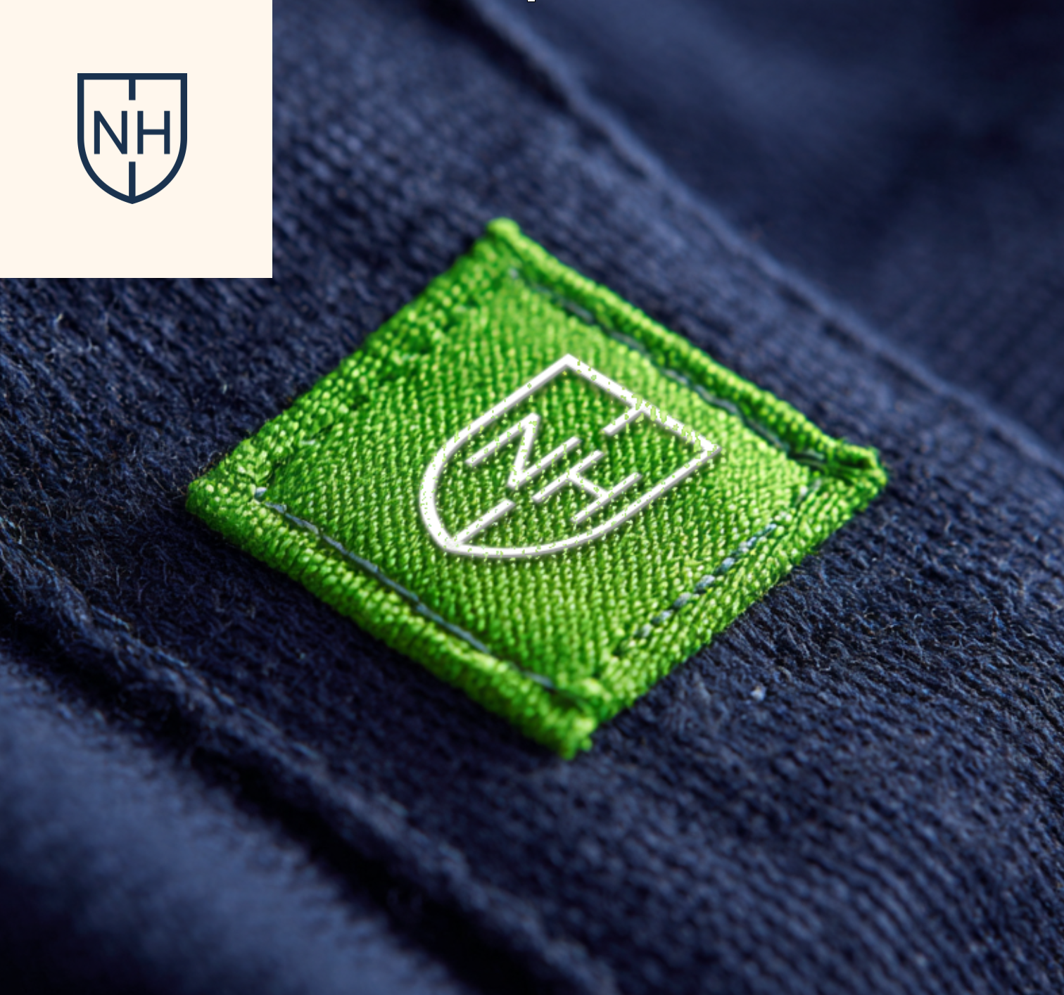
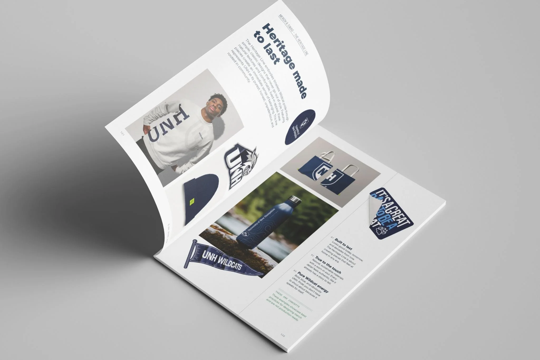
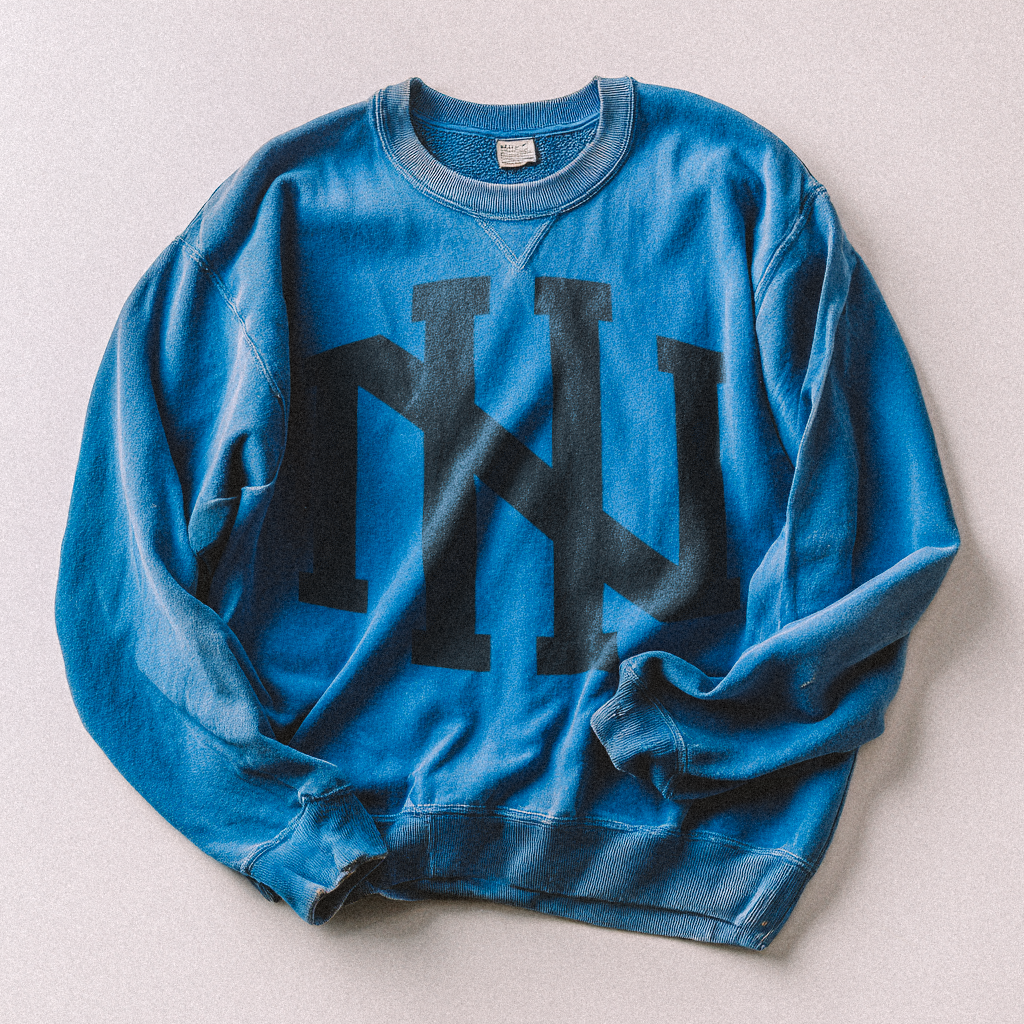
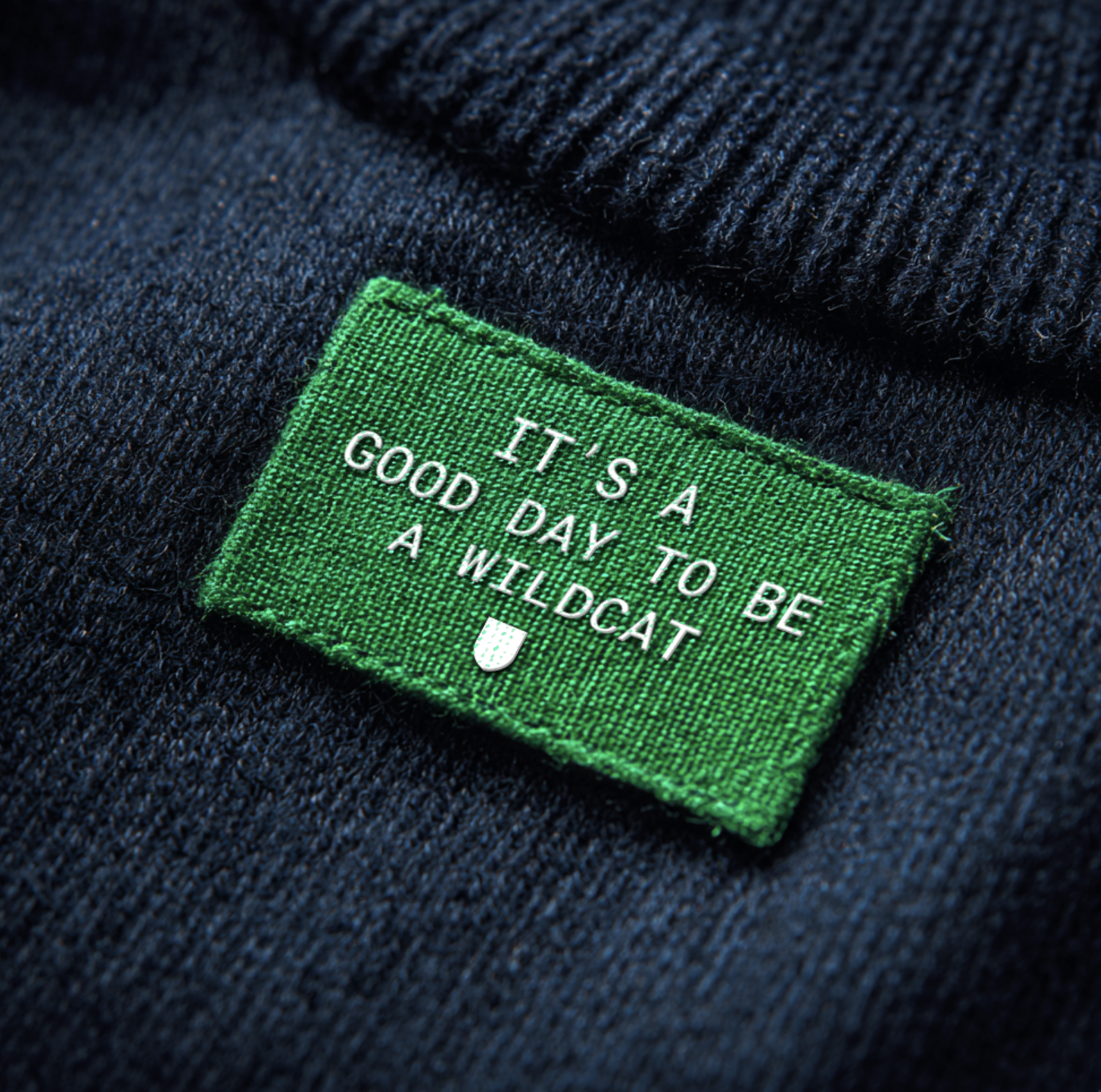
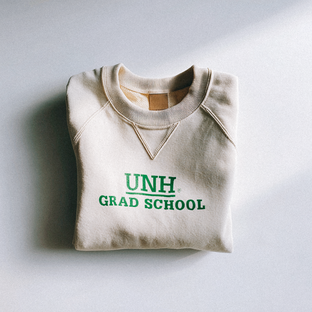
Extending the utility of an already iconic logo
A beloved brand embraced even further
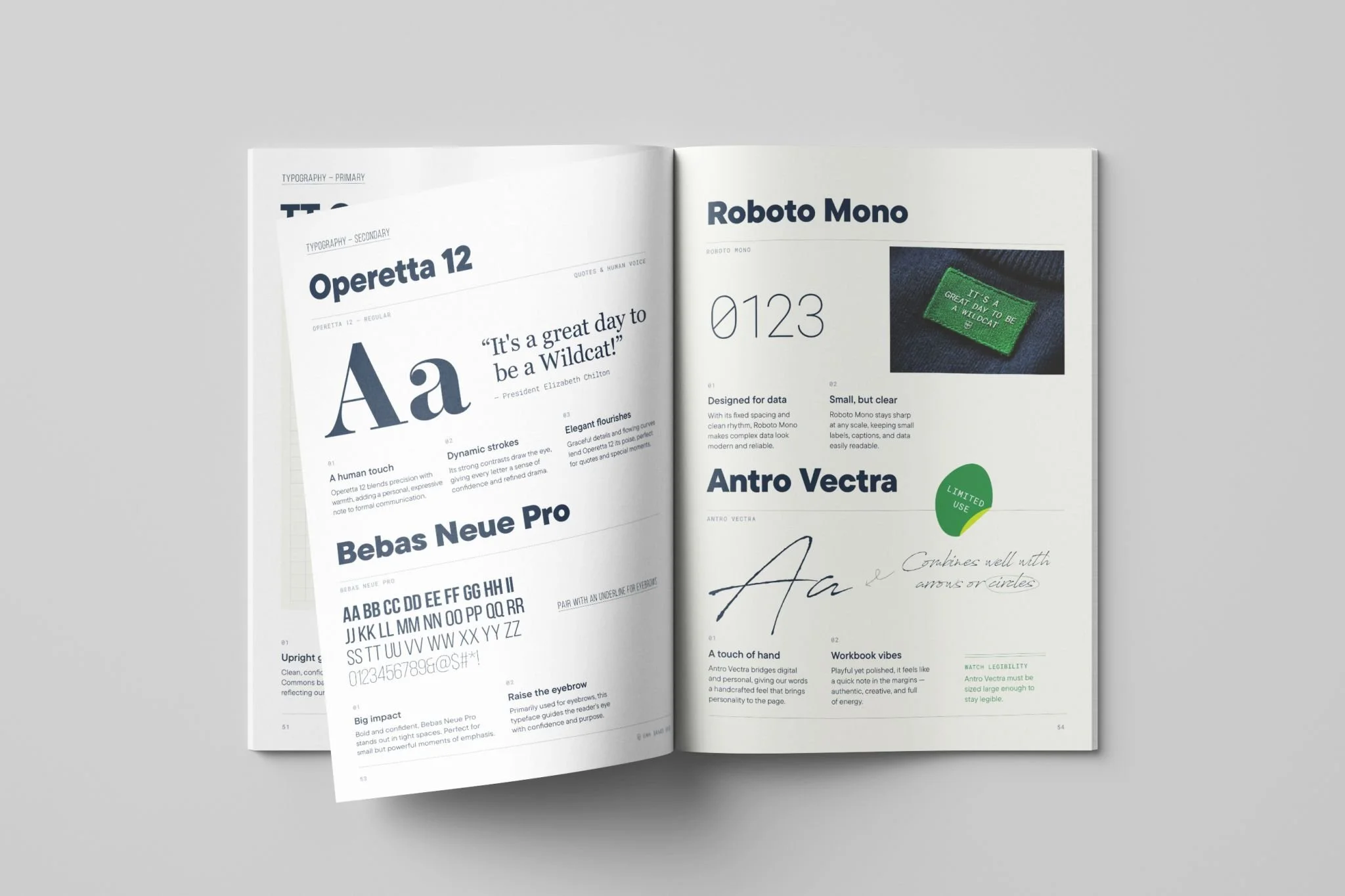
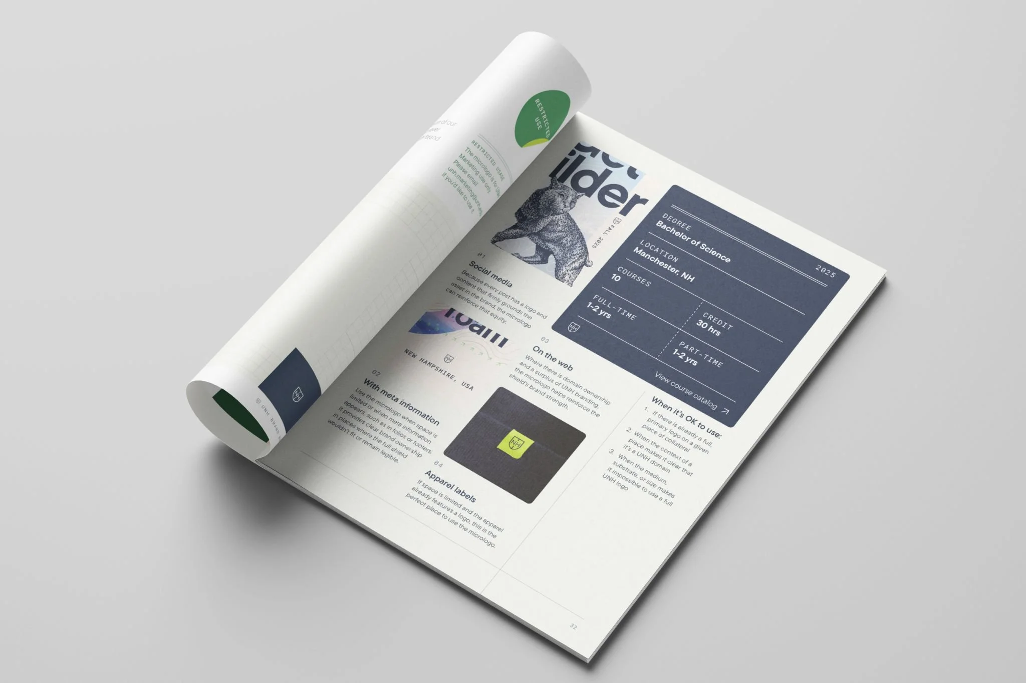
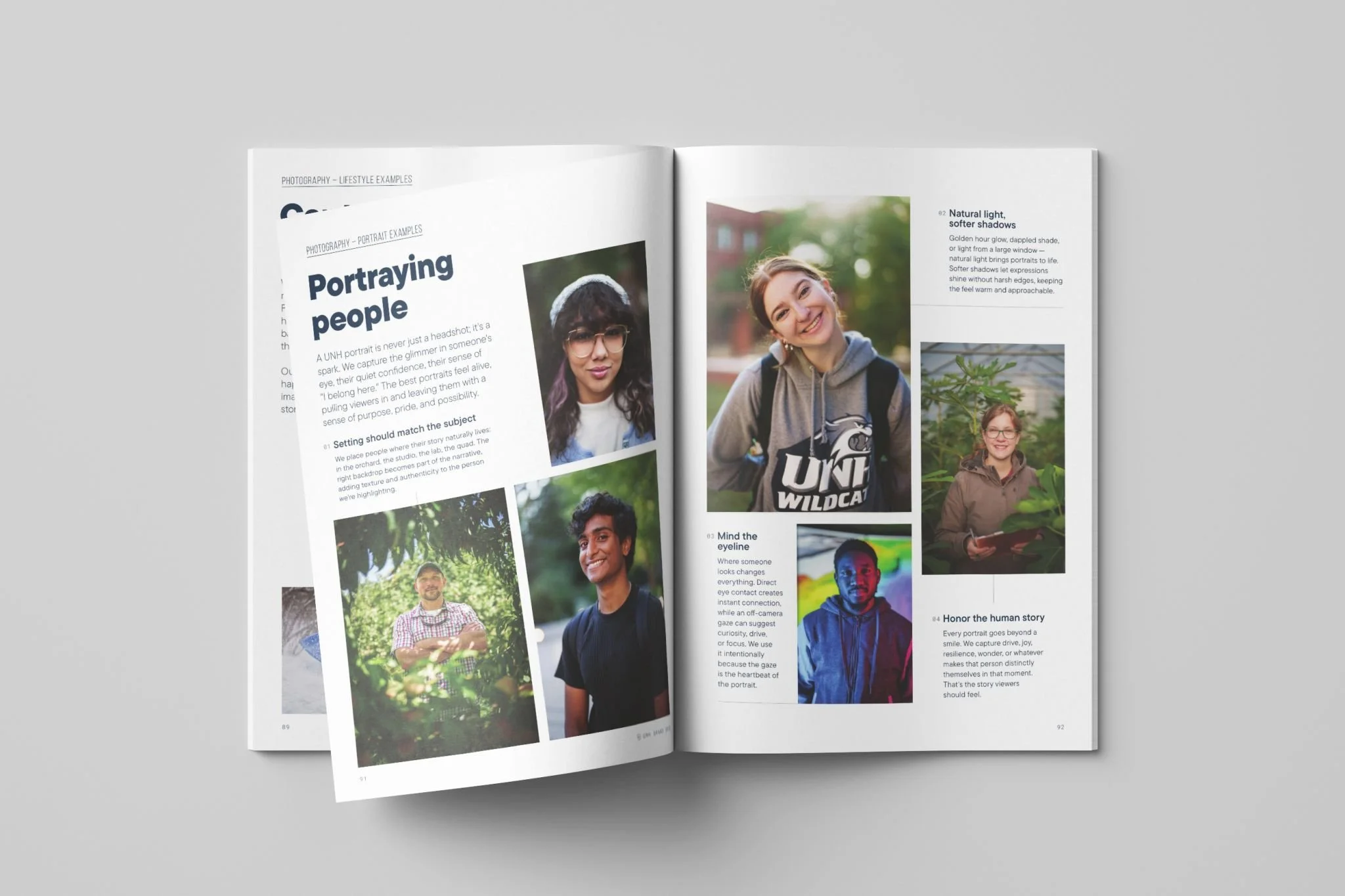
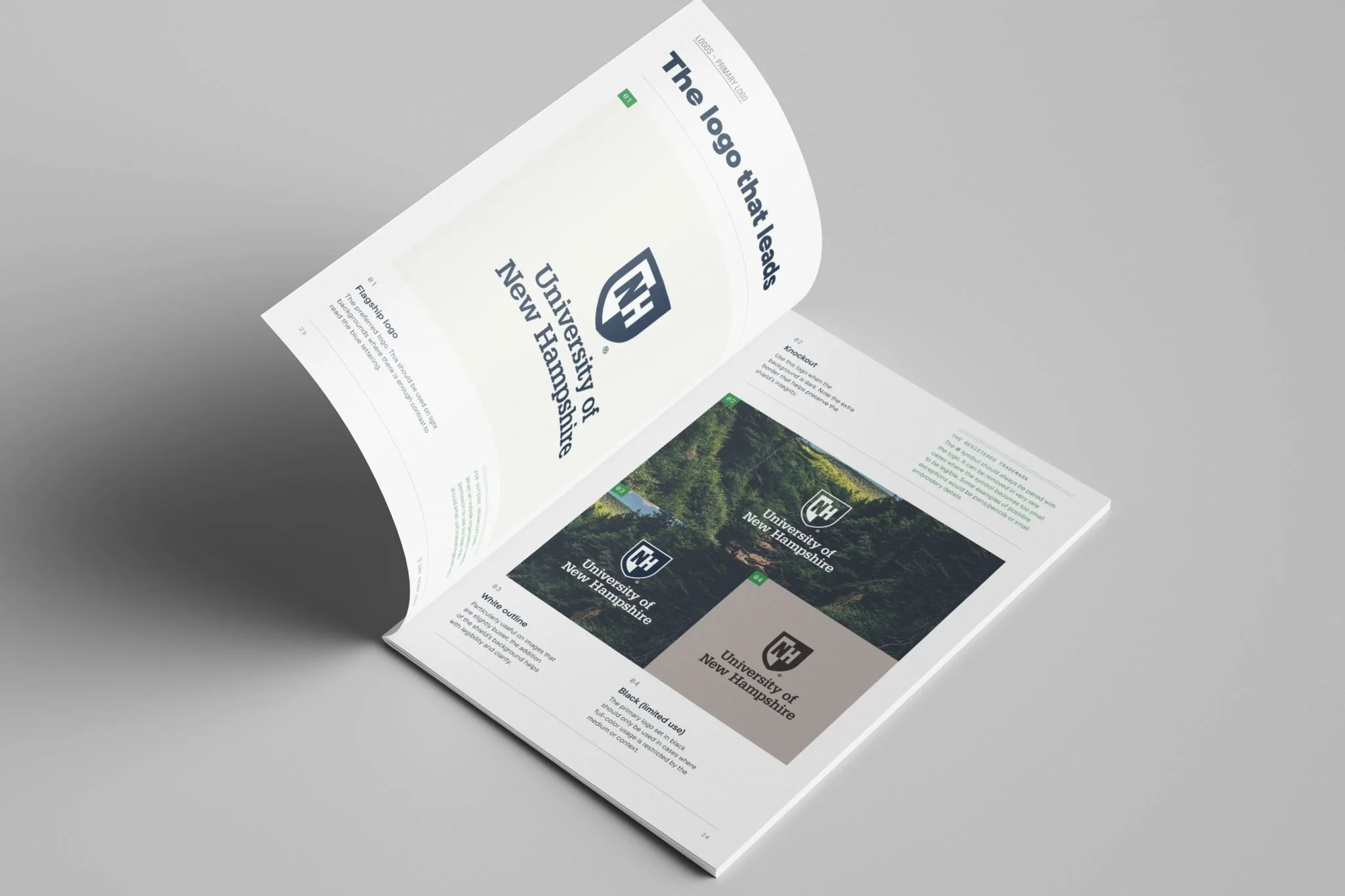
One key insight from the creative team was that the logo was a key fixture in campus culture—but deeply underutilized as a branding element. As part of developing the brand guide, we also explored ways that the logo could become even more useful in creating an own-able graphic.
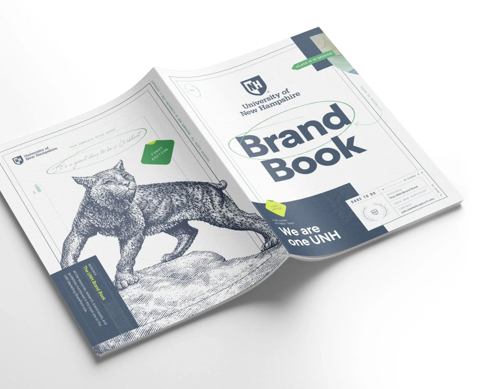
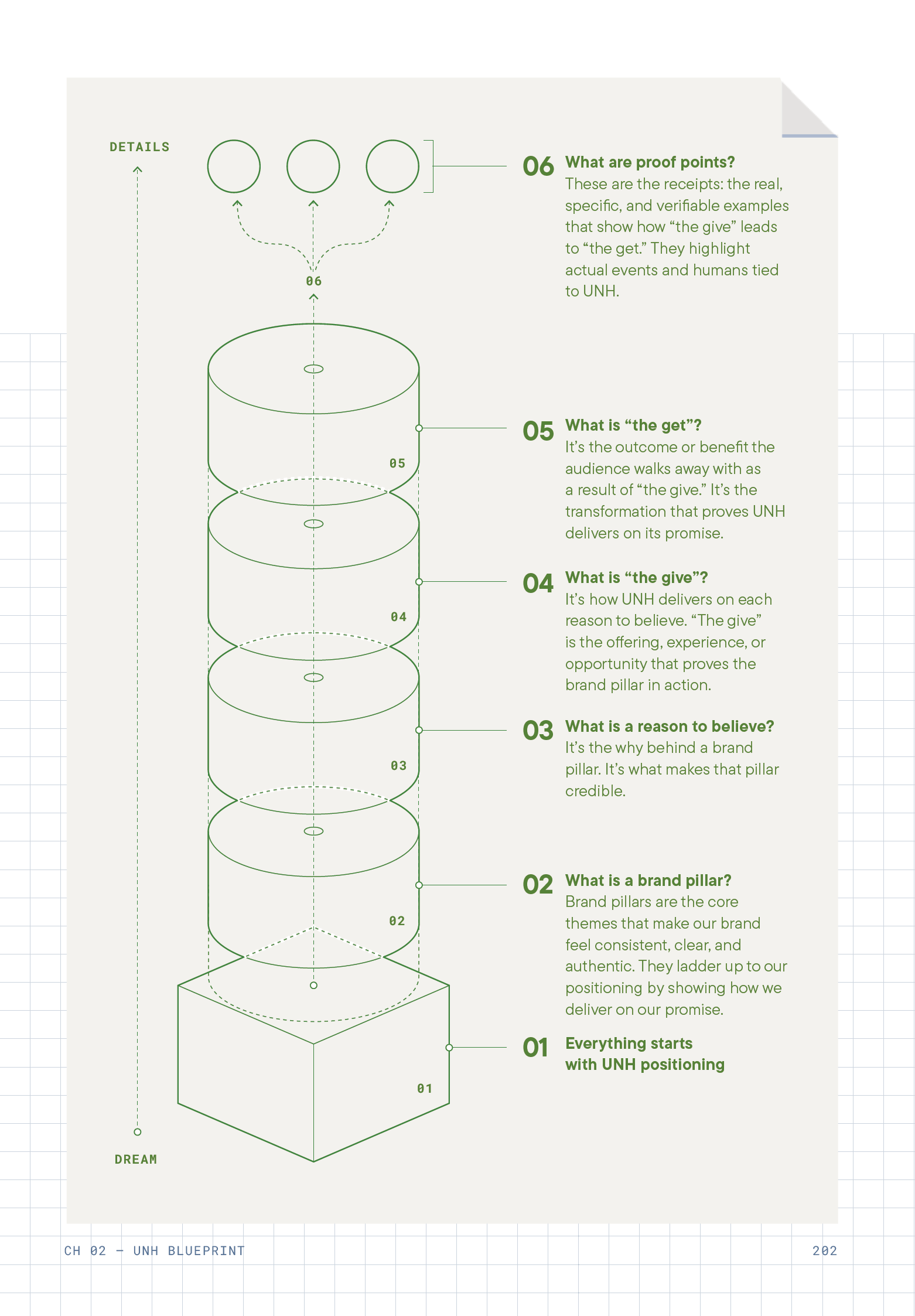
A tirelessly thorough brand guide
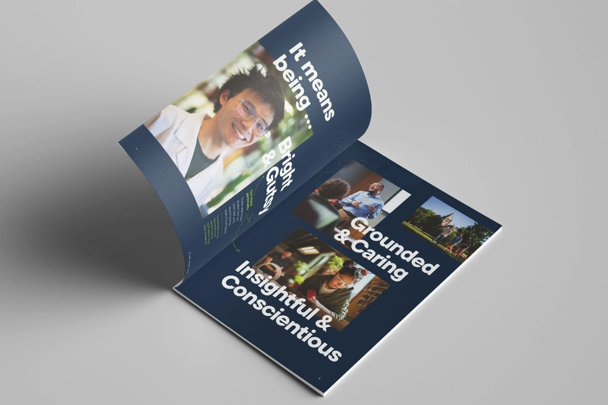
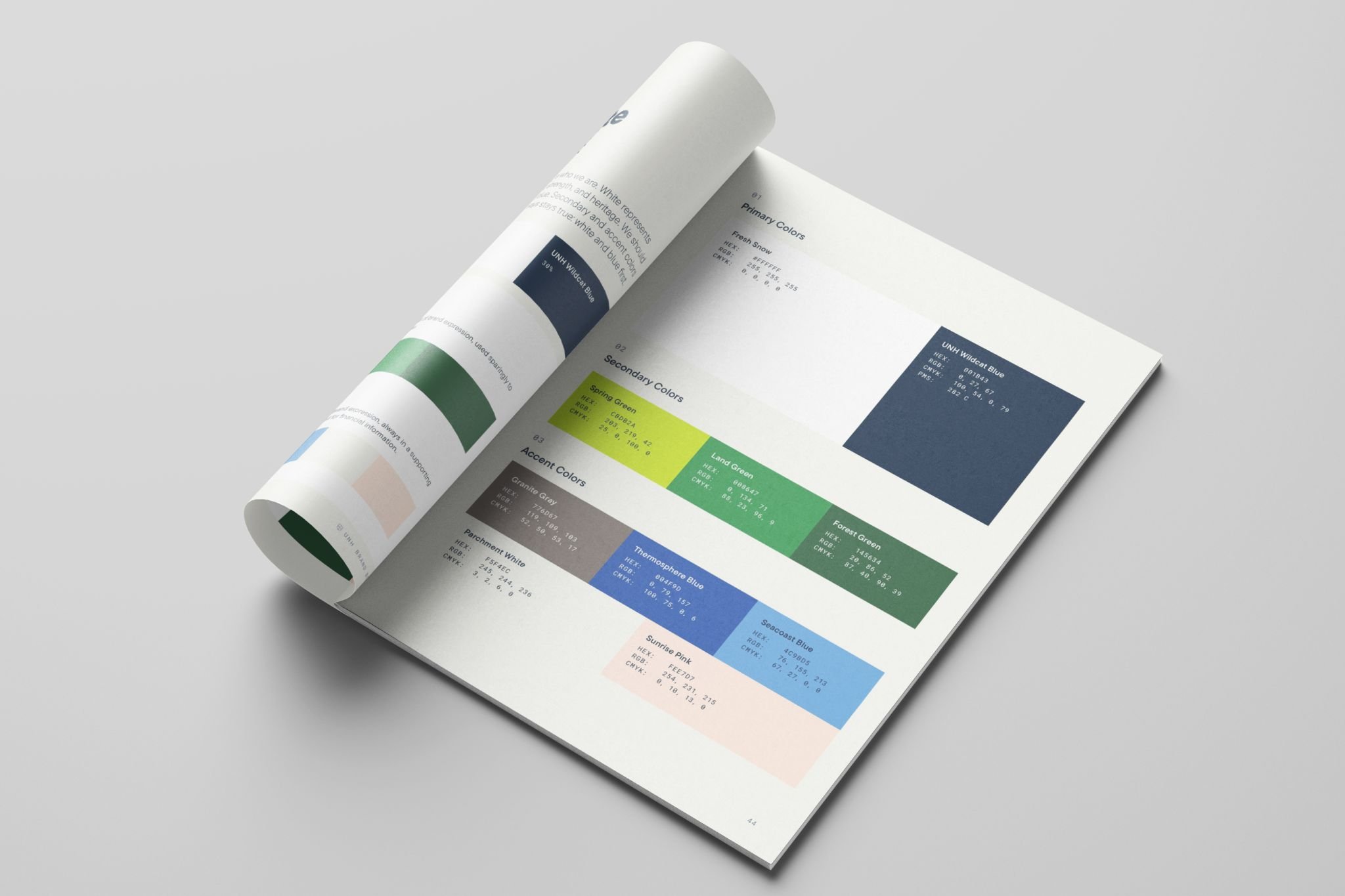
Nearly 200 pages of finely detailed instructions
Knowing that the brand would be in the hands of a decentralized communication network, we codified every detail of the new brand—from type size guidance to artistic expression to apparel fabrics—so professionals and hobbyists alike could thrive in it’s use.

Test it, break it, fix it—
rinse & repeat
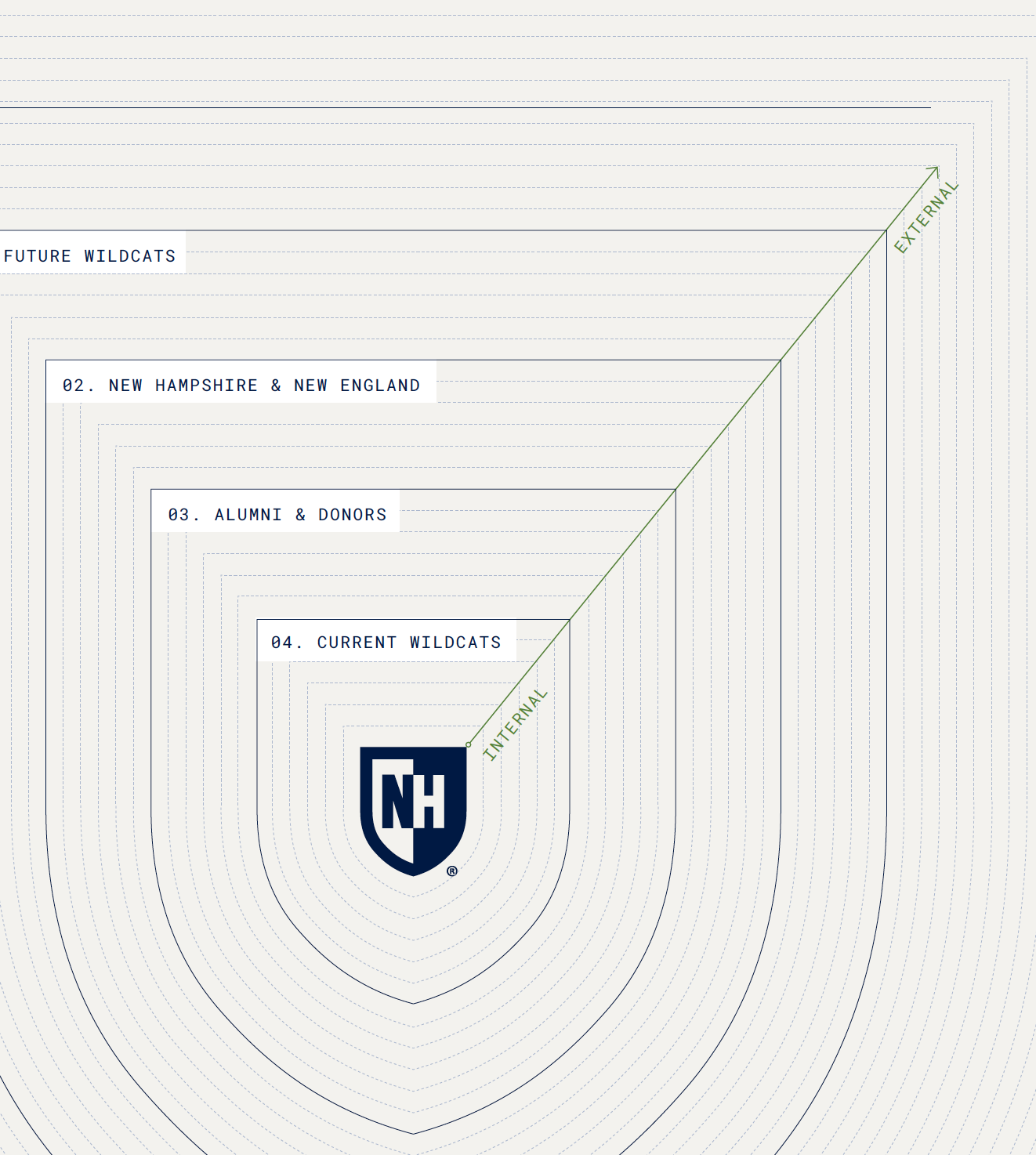
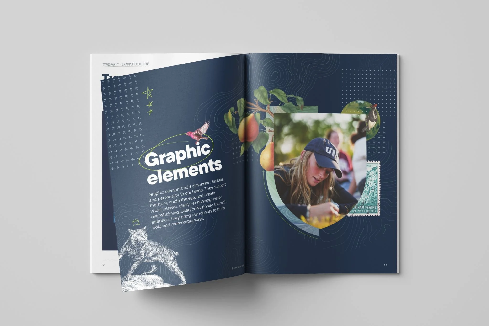
Turning experimentation into codified learnings
In a deeply collaborative process with UNH’s internal marketing experts, we started from scratch with the sky as the limit for brand expression.
Through multiple rounds of pushing the envelope, then centering toward existing brand values, then pushing some more, we identified key moments where evolving the brand would be most impactful.


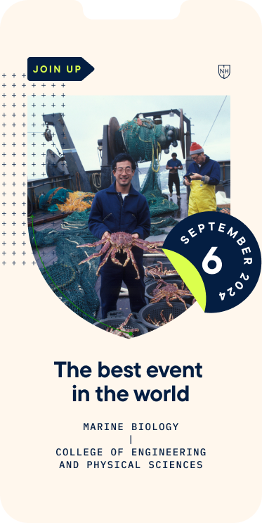


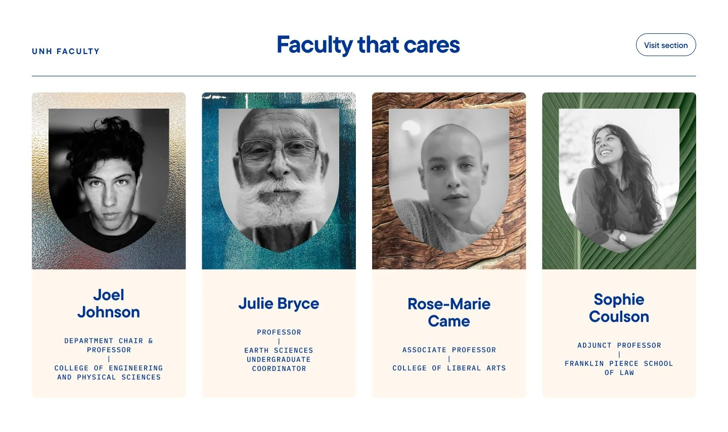
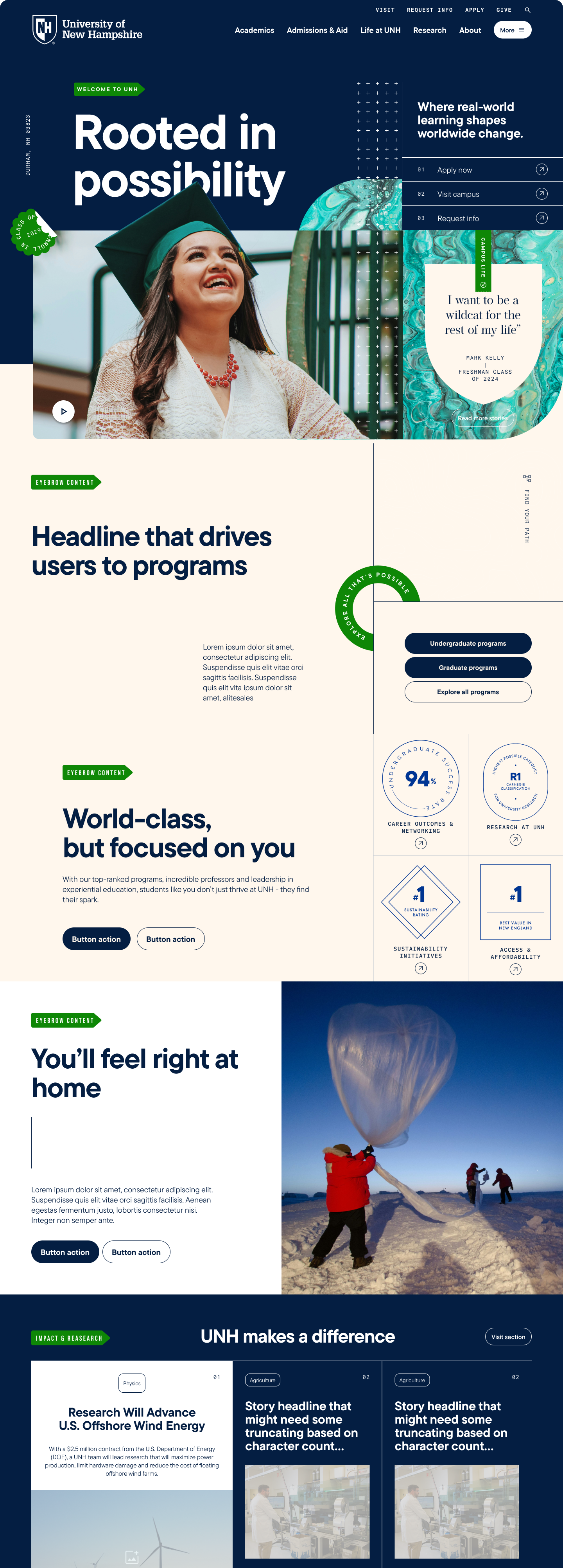
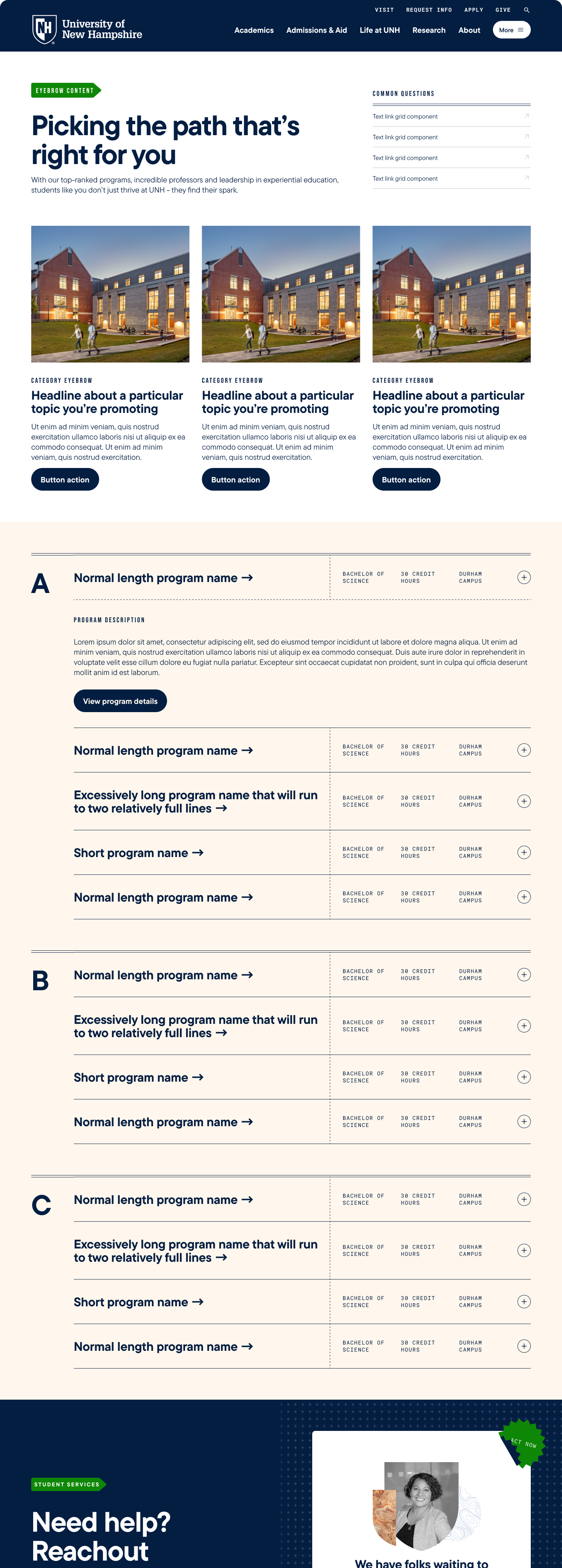
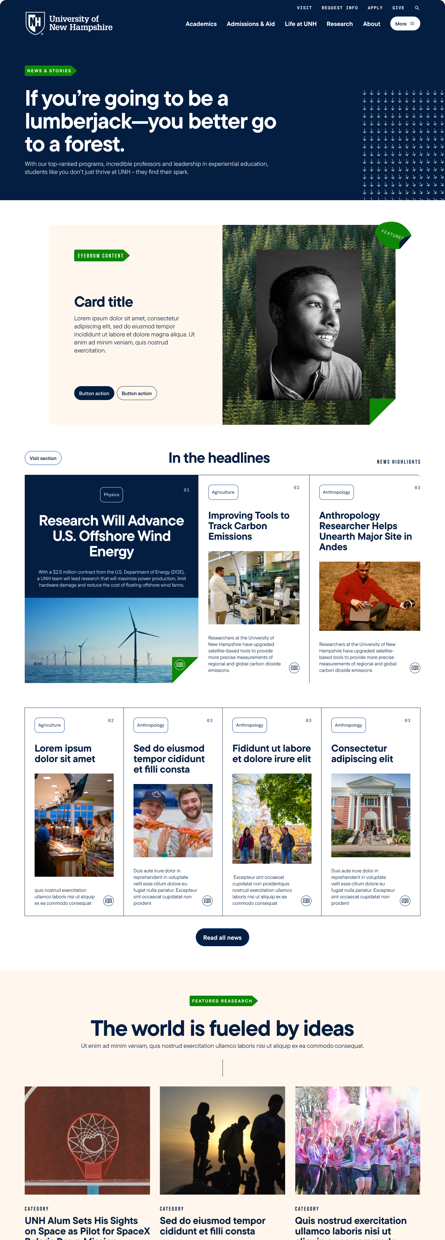
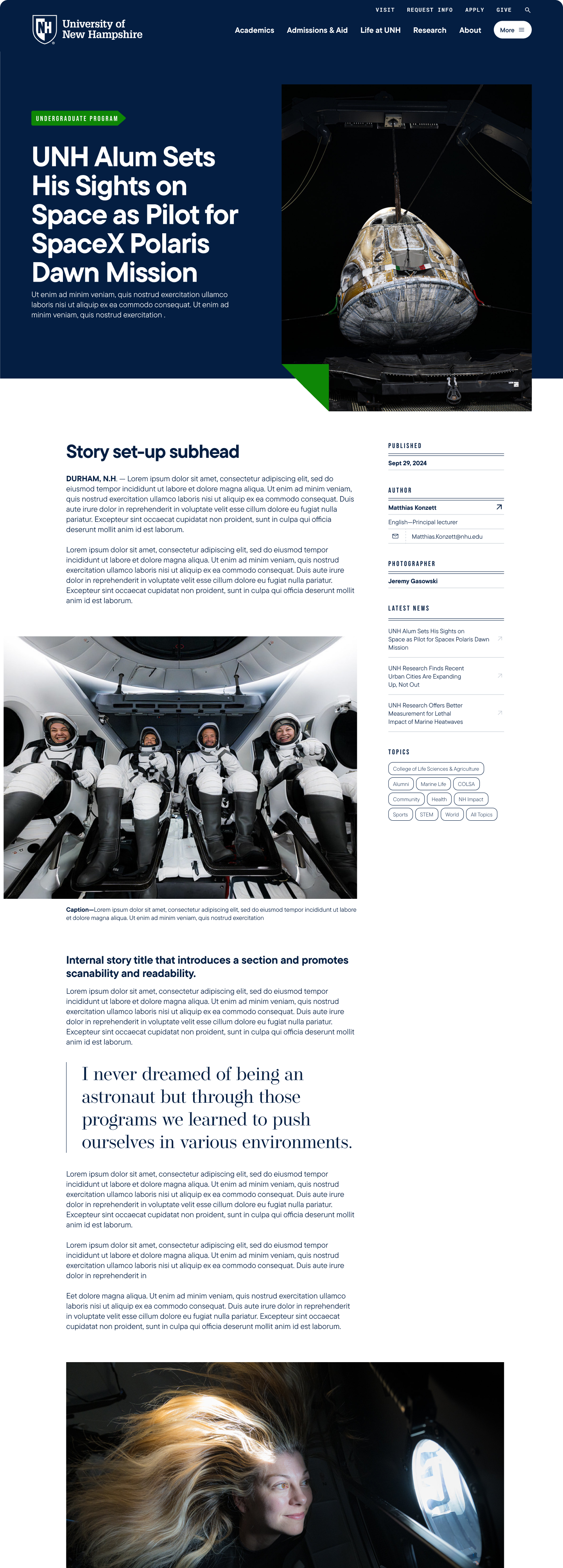
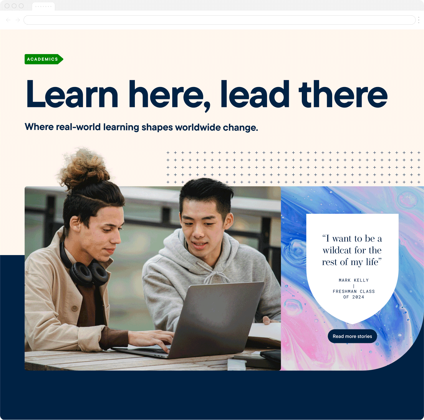
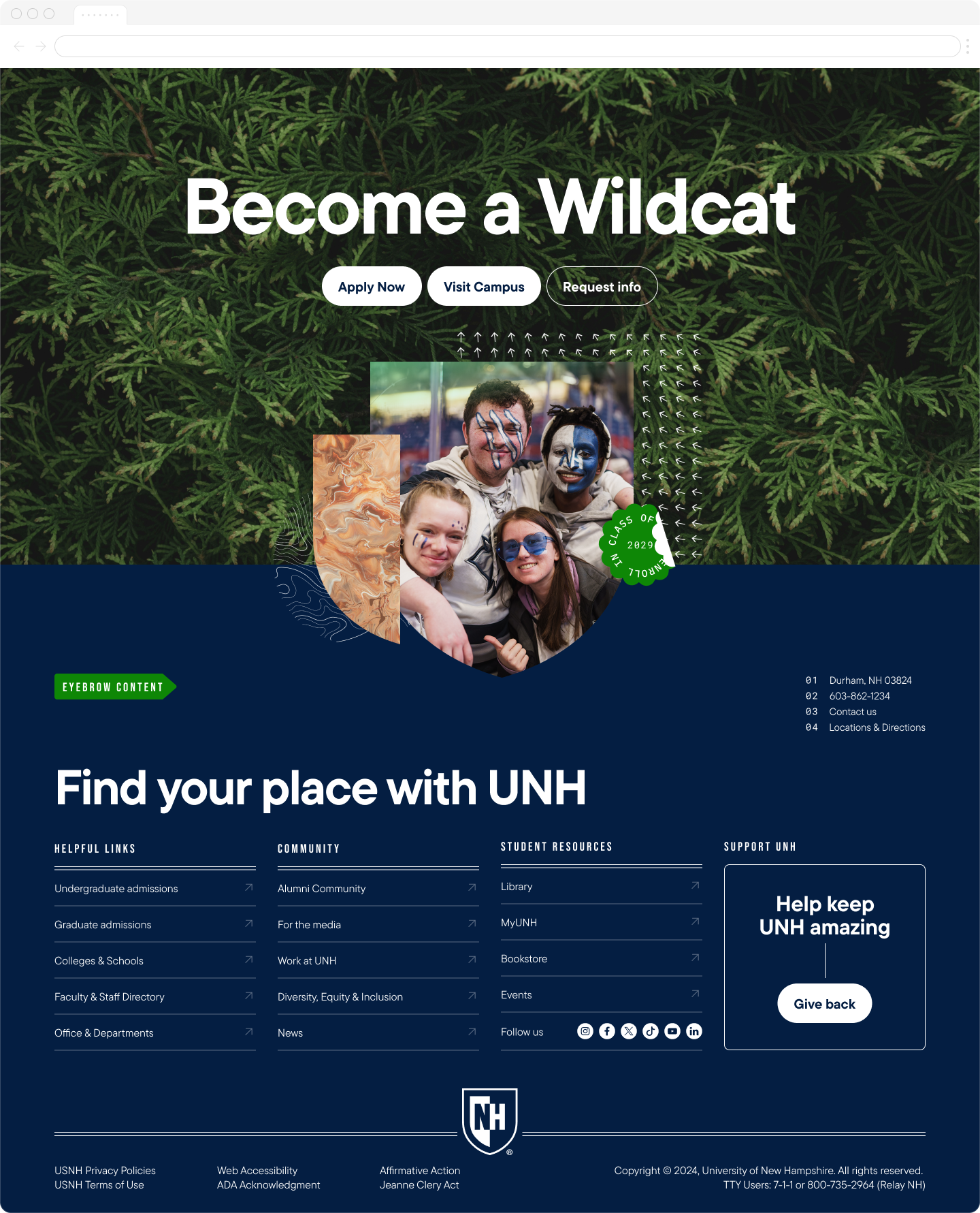
Giving a bright and gutsy brand it’s home on the web
Function over beauty—but beautiful all the same
In close consult with their internal engineering team, we built on top of a decade-old website without sacrificing the functionality or modernity of the new brand expression. We covered a broad base of stakeholder needs and removed long-felt pain points—all in service of getting more students inspired to join.
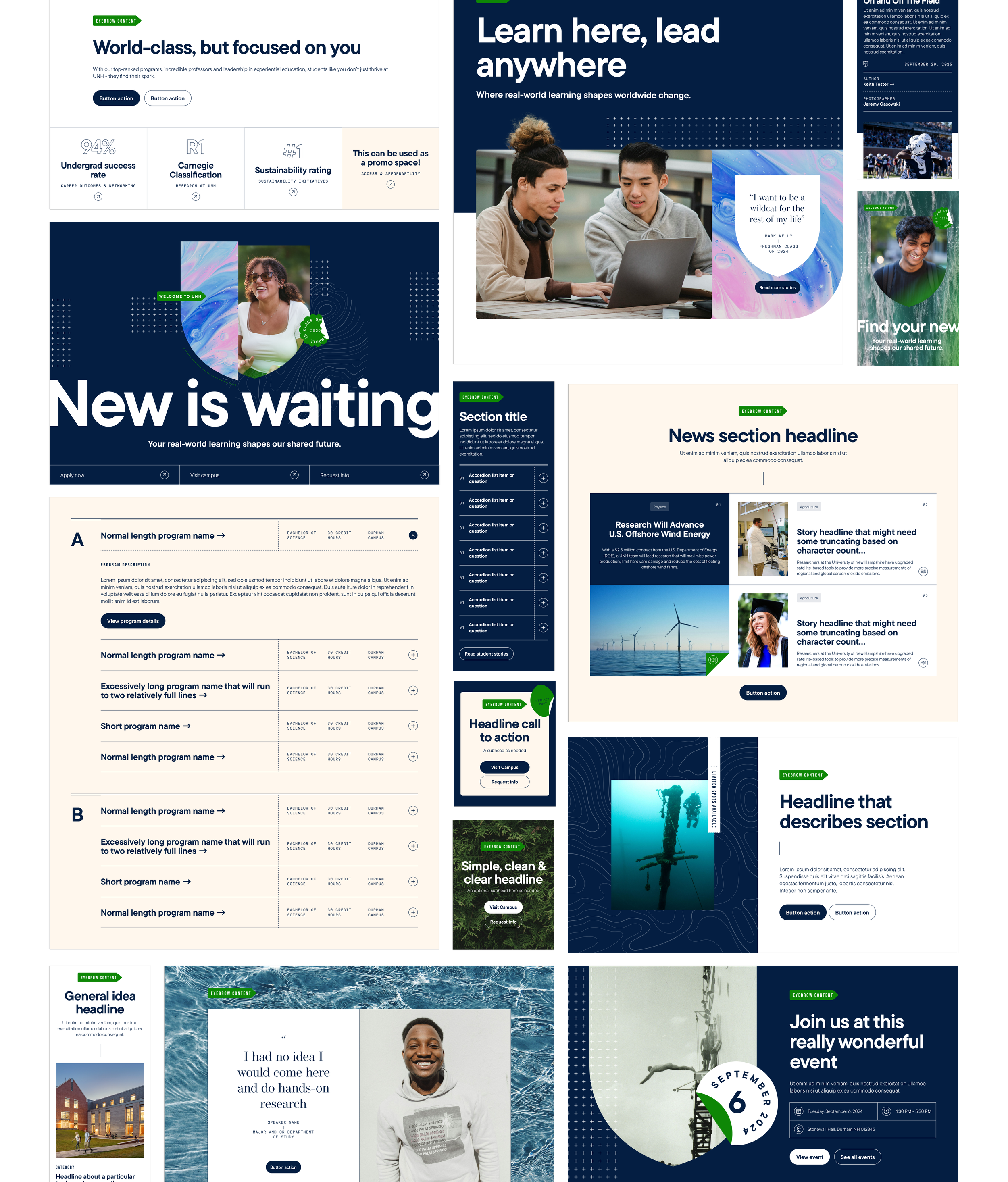
A tech-first site, but built to inspire students
Some key accomplishments
We provided 40 fully-custom components that could be re-used across the site.
Everything was designed with responsiveness in mind—so every prospect on every device had a beautiful experience.
We were rigorous in upholding accessibility standards so everyone can experience the same site.
We maintained a seamless relationship with engineering, working directly in predefined variables for the fastest, most reliable build.

The Impact
A new era for students, faculty, and the university
In a single season we launched both the new website and the overhauled brand guide to the creative teams across the university and to the greater public at large. What followed was a swell of excitement as teams learned, used, experimented with (and broke) the new guidelines. UNH’s appearance in the world changed to reflect what was already happening on campus — life changing experience, best-in-class education, and innovation that brings higher-ed to the next generation.
The team
Creative direction
Nate Baker
Chandra Carson
Writing
Chandra Carson
Marketing & Deveploment
UNH ET&S
Casey Glode
Jillian Collins
Danielle O’Neill
Design
Christian Gilbert
Joel Kuschke
Chann Chum